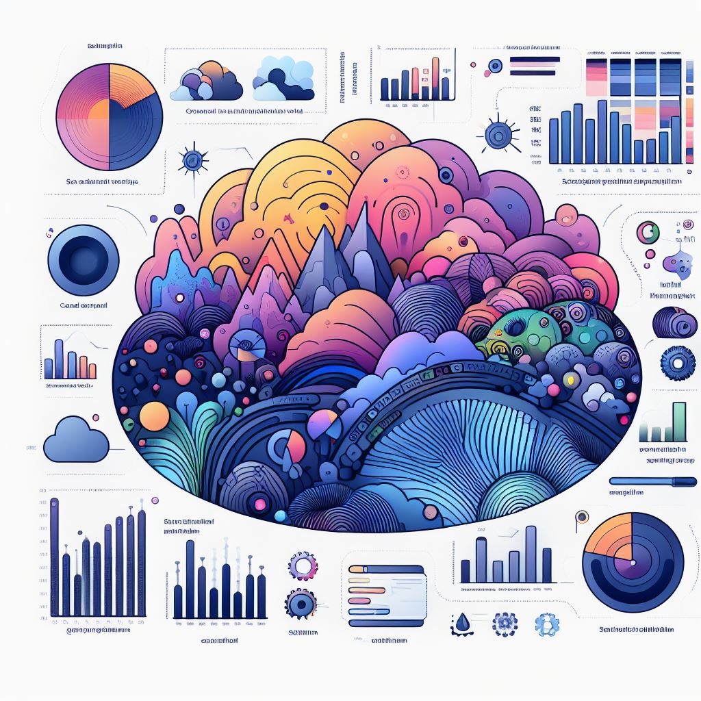
Introduction to Data Visualization in Data Science
Data visualization in data science is a powerful tool that aids in the understanding and analysis of complex data. By representing data visually, it becomes more accessible and interpretable, allowing individuals to extract meaningful insights. In the field of data science, where vast amounts of data are processed, data visualization in data science plays a crucial role in transforming raw numbers into actionable information.
Significance of Data Visualization in the Field of Data Science
Data visualization is integral to the field of data science for several reasons. Firstly, it allows data scientists to communicate their findings effectively to stakeholders who may not have a technical background. By presenting data visually, complex concepts can be conveyed in a clear and concise manner, ensuring that everyone is on the same page.
The Impact of Effective Data Visualization on Decision-Making Processes
Effective data visualization in data science has a significant impact on decision-making processes. When data is presented visually, decision-makers can grasp complex information more readily. Visual representations aid in identifying trends, outliers, and patterns, allowing decision-makers to make informed choices based on concrete evidence.
Moreover, data visualization facilitates the identification and understanding of correlations between different variables. It helps decision-makers to identify cause-and-effect relationships and make decisions that are backed by data.
Enhancing Data Understanding through Visual Representation
Simplifying Complex Data with Visual Elements
Data visualization in data science simplifies complex data by converting it into visually appealing and intuitive representations. By presenting data in a visual format, individuals can quickly grasp the underlying patterns and trends. For example, a line graph can effectively display the fluctuation of stock prices over time, enabling investors to make informed decisions.
Visual Storytelling: Connecting Patterns, Trends, and Insights
Data visualization enables visual storytelling by connecting patterns, trends, and insights. Instead of presenting a multitude of data points, visualizations allow for a clear narrative that highlights the most important aspects. This storytelling approach helps in conveying information effectively and engaging the audience.
Uncovering Hidden Relationships through Interactive Visualizations
Interactive visualizations take data understanding to the next level by allowing users to explore the data themselves. By interacting with the visualizations, users can uncover hidden relationships between variables and dive deeper into the data. This enables a more comprehensive understanding and facilitates the discovery of valuable insights.
Improving Data Exploration and Analysis
Leveraging Visual Analytics for Exploratory Data Analysis
Visual analytics combines data visualization with exploratory data analysis techniques. By leveraging visual analytics tools, data scientists can rapidly explore and analyze large datasets. This allows for the identification of patterns, outliers, and correlations that may have otherwise gone unnoticed. Visual analytics makes data exploration and analysis more efficient and effective.
Identifying Outliers, Anomalies, and Patterns Efficiently
Data science visualization aids in the efficient identification of outliers, anomalies, and patterns in data. By presenting data visually, data scientists can spot deviations from the norm or discern patterns that can provide valuable insights. Visual representation allows for a quicker and more accurate analysis of data.
Utilizing Interactive Visualizations for Dynamic Data Exploration
Interactive visualizations empower data scientists to explore data dynamically. By manipulating and interacting with the visualizations, they can uncover hidden insights and make real-time discoveries. Interactive visualizations provide flexibility and agility in data exploration, enabling data scientists to delve deeper into the data and extract meaningful information.
Enhancing Decision-Making and Predictive Analysis
Enabling Informed Decision-Making through Visual Insights
Data science visualization enables informed decision-making by providing visual insights into complex data. Decision-makers can grasp the implications of different options and choose the most appropriate course of action. By visualizing data, decisions are rooted in evidence, enhancing their accuracy and effectiveness.
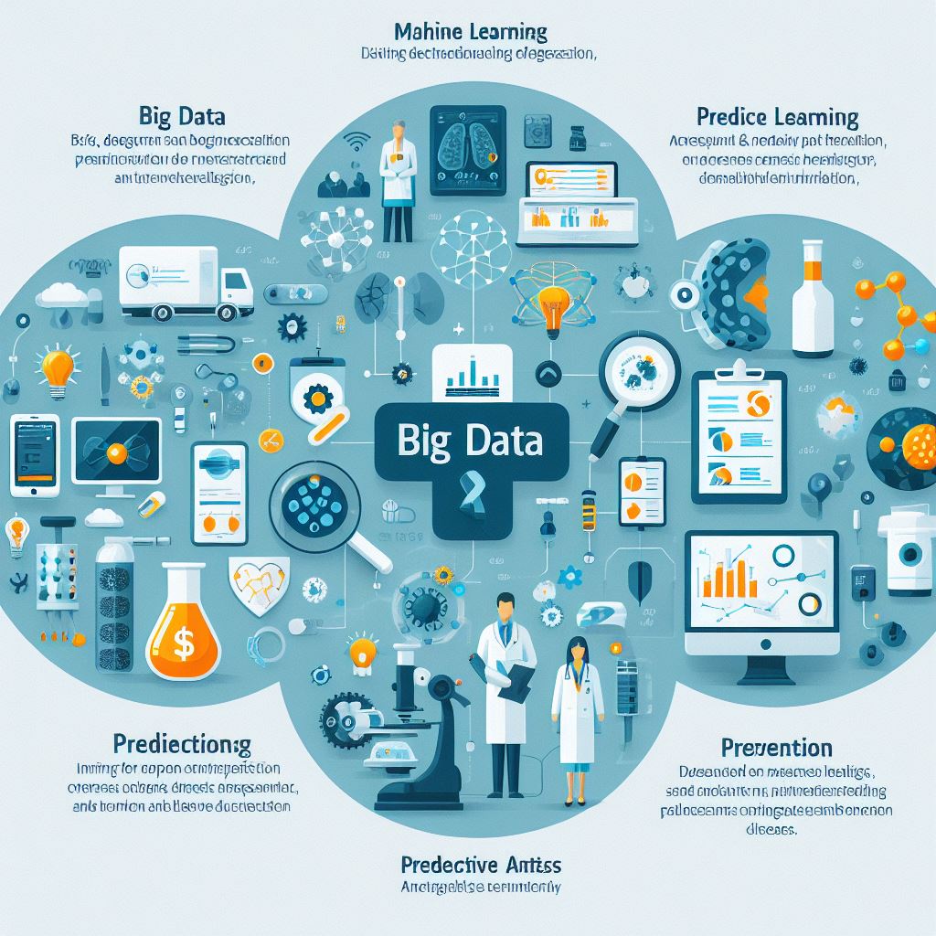
Leveraging Predictive Visualizations for Accurate Forecasting
Predictive visualizations leverage historical data to forecast future trends and outcomes. By utilizing visual representations, predictions become more understandable and transparent. Decision-makers can assess the reliability of forecasts and make informed choices based on the visual insights provided.
The Role of Visual Analytics in Identifying Actionable Strategies
Visual analytics plays a crucial role in identifying actionable strategies. By analyzing and visualizing data, decision-makers can uncover patterns and trends that indicate potential opportunities or risks. These visual insights guide the formulation of strategies that are driven by data, leading to improved outcomes.
Summary
The advantages of data visualization in data science are truly remarkable. Through visual representations, data becomes accessible, understandable, and actionable. Data visualization simplifies complex information, enhances communication and collaboration, improves data exploration and analysis, and enables informed decision-making and predictive analysis. In the era of big data, the power of data visualization tools cannot be overstated.
Frequently Asked Questions (FAQs)
Why are data visualizations crucial in data science?
Data visualizations are crucial in data science because they simplify complex data, enhance understanding, and facilitate effective communication. They enable data scientists and decision-makers to identify patterns, trends, and relationships that might go unnoticed in raw data. Data visualizations also play a significant role in exploratory data analysis, decision-making, and predictive analysis and applications of Decision-Making and Predictive Analysis.
Is data visualization limited to specific industries or sectors?
No, data visualization is not limited to specific industries or sectors. It is a universal tool that can be applied across diverse fields, including finance, healthcare, marketing, and more. Any domain that deals with data can benefit from data visualization to improve data understanding, communication, and decision-making.
What are the potential challenges in implementing data visualization in data science?
Implementing data visualization in data science can pose certain challenges. Some common challenges include selecting the most appropriate visualization techniques, handling large and complex datasets, ensuring data accuracy and quality, and maintaining the usability and interactivity of visualizations. Data scientists need to be mindful of these challenges and apply best practices to overcome them effectively.
How does data visualization improve data analysis?
Data science visualization tools simplify complex information, enhance pattern recognition, and facilitate data exploration, leading to improved comprehension and insights in data analysis.
What are the essential tools for effective data visualization?
Essential data science visualization tools include charting libraries, graphing software, mapping software, and interactive visualization platforms.
Is data visualization relevant for non-technical stakeholders?
Yes, data visualization is highly relevant for non-technical stakeholders as it presents complex data in an easily understandable and engaging manner.
How can data visualization help in identifying outliers?
Data visualization techniques such as scatter plots help identify outliers by highlighting data points that deviate significantly from the overall pattern.
Can data visualization be used for real-time data analysis?
Yes, data visualization can be used for real-time data analysis by leveraging interactive visualization tools that update in real-time, allowing for dynamic exploration and analysis of data.
Trending Posts
-
 What is the significance of digital marketing to building a brand?
06-04-2023
What is the significance of digital marketing to building a brand?
06-04-2023
-
 The Power of generative adversarial networks (GANs)
11-10-2023
The Power of generative adversarial networks (GANs)
11-10-2023
-
 Difference between Manual vs Computerized Accounts
26-10-2023
Difference between Manual vs Computerized Accounts
26-10-2023
-
 Concept of Object-Oriented Programming in java with Examples - oops
26-10-2023
Concept of Object-Oriented Programming in java with Examples - oops
26-10-2023
-
 Importance of Data Visualization in Data Science
27-10-2023
Importance of Data Visualization in Data Science
27-10-2023
-
 Introduction to Exception handling in java and types of Exceptions
01-11-2023
Introduction to Exception handling in java and types of Exceptions
01-11-2023
-
 Difference between Packages and Modules in python
01-11-2023
Difference between Packages and Modules in python
01-11-2023
-
 Workers in India need to be upskilled, reskilled in AI, automation
02-11-2023
Workers in India need to be upskilled, reskilled in AI, automation
02-11-2023
-
 Challenges in equipping job seekers with skills
02-11-2023
Challenges in equipping job seekers with skills
02-11-2023
-
 Control Structures in Python with examples. Condition Statements, loop and Control Flow Statements
04-11-2023
Control Structures in Python with examples. Condition Statements, loop and Control Flow Statements
04-11-2023
-
 Music can help learners improve their skills.
08-11-2023
Music can help learners improve their skills.
08-11-2023
-
 Data Structures And Algorithms In Python - Basic To Advanced Level
18-11-2023
Data Structures And Algorithms In Python - Basic To Advanced Level
18-11-2023
-
 An Introduction to nlp Natural Language Processing
22-11-2023
An Introduction to nlp Natural Language Processing
22-11-2023
-
 internship for computer science students
23-11-2023
internship for computer science students
23-11-2023
-
 The Impact of Predictive Analytics in Healthcare
30-11-2023
The Impact of Predictive Analytics in Healthcare
30-11-2023
-
 Guidelines for Protecting Removable Media
02-12-2023
Guidelines for Protecting Removable Media
02-12-2023
-
 What are Social Engineering Attacks? Common Techniques Used in Social Engineering Attacks
04-12-2023
What are Social Engineering Attacks? Common Techniques Used in Social Engineering Attacks
04-12-2023
-
 Importance of Search Engine Optimization and its Techniques
06-12-2023
Importance of Search Engine Optimization and its Techniques
06-12-2023
-
 Understanding AWS Buckets: The Essential Guide to Cloud Storage
11-12-2023
Understanding AWS Buckets: The Essential Guide to Cloud Storage
11-12-2023
-
 What is sem marketing? search engine marketing
12-12-2023
What is sem marketing? search engine marketing
12-12-2023
-
 What is SMM in Digital Marketing? Social Media Marketing
13-12-2023
What is SMM in Digital Marketing? Social Media Marketing
13-12-2023
-
 A Comprehensive Guide to Ensuring Security with Amazon EC2
15-12-2023
A Comprehensive Guide to Ensuring Security with Amazon EC2
15-12-2023
-
 Understanding Azure Storage Services - A Comprehensive Overview
19-12-2023
Understanding Azure Storage Services - A Comprehensive Overview
19-12-2023
-
 Mastering Azure App Services - Ultimate Toolkit for Success in Your Azure Course in Vizag
21-12-2023
Mastering Azure App Services - Ultimate Toolkit for Success in Your Azure Course in Vizag
21-12-2023
-
 An In-depth Exploration of Arrays in C
27-12-2023
An In-depth Exploration of Arrays in C
27-12-2023
-
 A Journey into AI Projects and Their Transformative Influence on the Contemporary World
27-12-2023
A Journey into AI Projects and Their Transformative Influence on the Contemporary World
27-12-2023
-
 Facebook Ads Webinar
27-12-2023
Facebook Ads Webinar
27-12-2023
-
 pricing models, cost efficiency and resource optimization techniques of Azure App Services
28-12-2023
pricing models, cost efficiency and resource optimization techniques of Azure App Services
28-12-2023
-
 Navigating the Cloud - An In-Depth Amazon VPC Overview
29-12-2023
Navigating the Cloud - An In-Depth Amazon VPC Overview
29-12-2023
-
 Demystifying Cloud Deployment Models: Choosing the Right Strategy for Your Business
30-12-2023
Demystifying Cloud Deployment Models: Choosing the Right Strategy for Your Business
30-12-2023
-
 A Comprehensive Guide to Basic Excel Formulas
01-01-2024
A Comprehensive Guide to Basic Excel Formulas
01-01-2024
-
 Unleashing the Power of Excel Search Functions Stream Data Analysis
02-01-2024
Unleashing the Power of Excel Search Functions Stream Data Analysis
02-01-2024
-
 Mastering Validations in Microsoft Excel: A Comprehensive Guide
03-01-2024
Mastering Validations in Microsoft Excel: A Comprehensive Guide
03-01-2024
-
 Mastering Structures in C: Understanding, Implementation, and Best Practices
04-01-2024
Mastering Structures in C: Understanding, Implementation, and Best Practices
04-01-2024
-
 C Union and benefits of using C unions in programming
05-01-2024
C Union and benefits of using C unions in programming
05-01-2024
-
 What are Microsoft Word Macros and How to Use Them?
08-01-2024
What are Microsoft Word Macros and How to Use Them?
08-01-2024
-
 Making Your Document Look Professional in ms word - Page Layout, Margins, Orientation and Size
10-01-2024
Making Your Document Look Professional in ms word - Page Layout, Margins, Orientation and Size
10-01-2024
-
 The Rise of blockchain Projects: Unveiling the Innovations of Shaping Digital Landscape
11-01-2024
The Rise of blockchain Projects: Unveiling the Innovations of Shaping Digital Landscape
11-01-2024
-
 Comprehensive Guide of Neural Network Architectures
11-01-2024
Comprehensive Guide of Neural Network Architectures
11-01-2024
-
 The Future is Here: How Blockchain Technology is Reshaping Industries and Redefining Trust
12-01-2024
The Future is Here: How Blockchain Technology is Reshaping Industries and Redefining Trust
12-01-2024
-
 powerpoint presentation-Page Transitions: Enhancing Navigation and User Experience
17-01-2024
powerpoint presentation-Page Transitions: Enhancing Navigation and User Experience
17-01-2024
-
 Exploring the Power of Multimedia in PowerPoint Presentations
18-01-2024
Exploring the Power of Multimedia in PowerPoint Presentations
18-01-2024
-
 Mastering Photoshop Layers: A Comprehensive Guide to Professional Results
19-01-2024
Mastering Photoshop Layers: A Comprehensive Guide to Professional Results
19-01-2024
-
 Enhance Your Photoshop Skills with Expert Selection Techniques
20-01-2024
Enhance Your Photoshop Skills with Expert Selection Techniques
20-01-2024
-
 Life and Work on a Cruise Ship - What to Expect?
22-01-2024
Life and Work on a Cruise Ship - What to Expect?
22-01-2024
-
 Mastering Photoshop Masks: A Step-by-Step Guide to Enhance Your Photo Editing Skills
23-01-2024
Mastering Photoshop Masks: A Step-by-Step Guide to Enhance Your Photo Editing Skills
23-01-2024
-
 Enhance Your Digital Artistry with the Top Photoshop Brushes for Every Style and Project
27-01-2024
Enhance Your Digital Artistry with the Top Photoshop Brushes for Every Style and Project
27-01-2024
-
 The reason behind the success of Milan 2024
26-02-2024
The reason behind the success of Milan 2024
26-02-2024
-
 Visakhapatnam is witnessing comprehensive growth across all sectors!
06-03-2024
Visakhapatnam is witnessing comprehensive growth across all sectors!
06-03-2024
-
 Vizag's Journey Towards Becoming a Global IT Destination
12-03-2024
Vizag's Journey Towards Becoming a Global IT Destination
12-03-2024
-
 the best software courses after the 10th/Intermediate exams for Students
02-04-2024
the best software courses after the 10th/Intermediate exams for Students
02-04-2024
-
 2024's Tech Frontier: A Deep Dive into Software Development Trends
16-04-2024
2024's Tech Frontier: A Deep Dive into Software Development Trends
16-04-2024
-
 4 Important benefits for Continuous Learning in Tech
07-05-2024
4 Important benefits for Continuous Learning in Tech
07-05-2024
-
 A Beginner's Guide to AWS, Azure, and Google Cloud Platform
14-05-2024
A Beginner's Guide to AWS, Azure, and Google Cloud Platform
14-05-2024
-
 Why Full Stack Python is a Must-Learn Skill for Aspiring Developers?
12-09-2024
Why Full Stack Python is a Must-Learn Skill for Aspiring Developers?
12-09-2024
-
 What’s Next? The Future of Asteroid Tracking with IT
16-09-2024
What’s Next? The Future of Asteroid Tracking with IT
16-09-2024
-
 Learn AutoCAD 2D Mechanical Drawing with Our Comprehensive CAD Software Course
19-09-2024
Learn AutoCAD 2D Mechanical Drawing with Our Comprehensive CAD Software Course
19-09-2024